
Sử dụng SweetAlert để làm hộp thoại alert của javascript trở nên đẹp và ấn tượng hơn
GIỚI THIỆU
SweetAlert sẽ khiến bạn ngạc nhiên với giao diện hết sức thân thiện và trang nhã, việc kết hợp các hiệu ứng giúp cho hộp thoại alert của bạn nổi bật hơn bao giờ hết, và nếu như so sánh với alert mặc định của javascript thì có lẽ bạn sẽ không bao giờ quay trở lại sử dụng cách truyền thống cho các thiết kế website của mình. Việc cấu hình SweetAlert rất đơn giản với nhiều tuỳ chọn và callback sẽ giúp cho bạn hoàn toàn làm chủ hộp thoại alert của mình
CÀI ĐẶT (BOWER)
bower install sweetalertHƯỚNG DẪN SỬ DỤNG
1. Thêm CSS & Javascript
<link rel='stylesheet' href='https://cdn.rawgit.com/t4t5/sweetalert/v0.2.0/lib/sweet-alert.css'>
<script src='https://cdn.rawgit.com/t4t5/sweetalert/v0.2.0/lib/sweet-alert.min.js'></script>
2. HTML
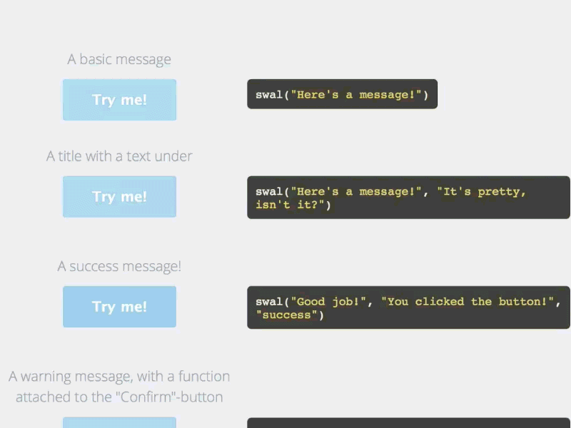
Tạo một vài button để thử nghiệm các tính năng tuỳ biến của SweetAlert
<div class="example">
  <button id="b1">A basic message</button>
  <button id="b2">A title with a text under</button>
  <button id="b3">A success message!</button>
  <button id="b4">A warning message, with a function attached to the "Confirm"-button...</button>
  <button id="b5">... and by passing a parameter, you can execute something else for "Cancel".</button>
  <button id="b6">A message with a custom icon</button>
</div>
3. CSS
Thêm chút CSS để button hiển thị đẹp hơn
.example button {
  float: left;
  background-color: #4E3E55;
  color: white;
  border: none;
  box-shadow: none;
  font-size: 17px;
  font-weight: 500;
  font-weight: 600;
  border-radius: 3px;
  padding: 15px 35px;
  margin: 26px 5px 0 5px;
  cursor: pointer;
}
.example button:focus{
  outline: none;
}
.example button:hover{
  background-color: #33DE23;
}
.example button:active{
  background-color: #81ccee;
}
4. Gọi hàm SweetAlert
SweetAlert cung cấp hàm swal() (viết tắt của sweet alert), như các bạn thấy, chúng ta có thể truyền các tham số để tuỳ biến việc hiện thỉ và chức năng của sweet alert.
document.getElementById('b1').onclick = function(){
	swal("Here's a message!");
};

document.getElementById('b2').onclick = function(){
	swal("Here's a message!", "It's pretty, isn't it?")
};

document.getElementById('b3').onclick = function(){
	swal("Good job!", "You clicked the button!", "success");
};

document.getElementById('b4').onclick = function(){
	swal({
		title: "Are you sure?",
		text: "You will not be able to recover this imaginary file!",
		type: "warning",
		showCancelButton: true,
		confirmButtonColor: '#DD6B55',
		confirmButtonText: 'Yes, delete it!',
		closeOnConfirm: false,
		//closeOnCancel: false
	},
	function(){
		swal("Deleted!", "Your imaginary file has been deleted!", "success");
	});
};

document.getElementById('b5').onclick = function(){
	swal({
		title: "Are you sure?",
		text: "You will not be able to recover this imaginary file!",
		type: "warning",
		showCancelButton: true,
		confirmButtonColor: '#DD6B55',
		confirmButtonText: 'Yes, delete it!',
		cancelButtonText: "No, cancel plx!",
		closeOnConfirm: false,
		closeOnCancel: false
	},
	function(isConfirm){
    if (isConfirm){
      swal("Deleted!", "Your imaginary file has been deleted!", "success");
    } else {
      swal("Cancelled", "Your imaginary file is safe :)", "error");
    }
	});
};

document.getElementById('b6').onclick = function(){
	swal({
		title: "Sweet!",
		text: "Here's a custom image.",
		imageUrl: 'http://i.imgur.com/4NZ6uLY.jpg'
	});
};
DEMO
See the Pen sweetalert demo by Thanh Nguyen (@genievn) on CodePen.
TUỲ BIẾN
| Tham số | Giá trị mặc định |
|
|---|---|---|
| title | null (required) | Tiêu đề hộp thoại alert |
| text | null | Mô tả hộp thoại alert |
| type | null | Loại alert: SweetAlert cung cấp 4 loại đã được xây dựng sẵn: "warning", "error", "success" và "info". |
| allowOutsideClick | false | Cho phép tắt bằng cách bấm ra ngoài hội thoại |
| showCancelButton | false | Hiển thị nút Cancel, dùng để đóng hộp thoại |
| confirmButtonText | "OK" | Thay đổi chữ cho nút Confirm. Nếu showCancelButton được đặt là true, thì sẽ đặt tự đồng là "Confirm" thay vì "OK". |
| confirmButtonColor | "#AEDEF4" | Thay đổi mầu nền của nút "Confirm" (giá trị HEX). |
| cancelButtonText | "Cancel" | Thay đổi chữ của nút "Cancel" |
| closeOnConfirm | true | Đặt false nếu bạn muốn hộp thoại tiếp tục mở khi người dùng bấm nút "Confirm". Chức năng này hữu dụng khi hàm callback gắn với nút Confirm gọi đến một hộp thoại SweetAlert khác. |
| closeOnCancel | true | Đặt false nếu bạn muốn hộp thoại tiếp tục mở khi người dùng bấm nút "Cancel". Chức năng này hữu dụng khi hàm callback gắn với nút Cancel gọi đến một hộp thoại SweetAlert khác. |
| imageUrl | null | Đường dẫn gắn hình ảnh iconcho hộp thoại |
| imageSize | "80x80" | Nếu imageUrl được thiết lập, bạn có thể đặt [rộng] x [cao] cho hình ảnh |